Greenland and Iceland

Qaqortoq, Greenland / Finished / Yao Cheng
GREENLAND:
I wanted to add an additional painting, like Reykjavík, that takes place among blankets of snow to my Travel series. When I was researching destinations around the world, Qaqortoq in Greenland stood out for me. The colors of this Arctic village against a backdrop of white captured my imagination immediately!
I knew that the contrast between white and all other colors would be the main focus of this painting. Fun fact: its name, Qaqortoq, means “The White” in Greenlandic. So, it was important that I made the white snow take center stage. But, before I could start painting, I had to consider the two components that would make this main focus vivid and dynamic. One part was the color palette, which I felt confident in composing the colors for. The other part, though, was how to capture the feeling of snow. This part immediately became the more interesting one, and I was not so sure here of how to approach it…How to paint snow in a way that felt more natural? But at the same time feel lively? I could approach it by “adding-on” or by “taking-away”. In the end, I decided on mostly painting by taking-away, but with small bits of adding-on for details at the end.
painting by taking-away:
Painting snow is always fun, but using my own taking-away method made it more challenging. For Greenland, I imagined snow as both being there and not there. It is there as the falling snow, something that covered up and blanketed the homes. But it also disappeared into the mountains and merged back into the landscape. In another words, the snow was interacting with both the foreground and the background. And so, simultaneously, I began painting the snow that is there and the parts of it that falls away.
“This is what made this artwork challenging- every brush stroke was telling the story of the snow that was there and what was not there.”


Sometimes, when I talk about my painting process, words fail me. So much of it is about being in the moment and what ideas are popping up right then. This makes it difficult to describe them accurately with words! Hopefully though, the in-process photos above can better illustrate how I approached this.
For example, the image on the left was taken when much of the snow has already been established. I could visually see, by this point, how the snow is both there and not there. The image on the right is after details are added in, further strengthening the dual quality of snow.
The in-process images also show how I used the shapes of the village homes as an opportunity to create the suggestions of snow. They inform where the snow is without me actually painting it. Slowly, the snow began to take its own shape, even as it sat back as the color white. It is then layered with other colors, shapes and more village homes! The result is subtle, and perhaps if not for reading this, you may not even notice this intention. However, this approach played a big role in why this painting felt right to me and distinct from one where all of the snow was painted in using white gouache.
Finishing with adding-in:
Once I felt that the snow was starting to shape into the main focus, I moved along to adding-in white for final details. Here though, the white is no longer the snow but trims and other ornamental details. Let me just say- I get very excited about embellishing details for my Travel Series! I often fall into a rabbit hole of infinite accents that I want to add in. It takes a lot of restraint from my pragmatic brain to stop and call an artwork finished.
This part was much easier to do than the taking-away part. I could adorn my painting however and wherever I liked!

Details
My favorite part of painting a travel artwork is adding all the little details that bring it to life! Many of these particulars can be found in windows, doors, potted plants and trees. My imagination runs wild with all of the color possibilities.
in the shop:
You can now find the finished piece in my Art Prints shop! It will make a festive, wintery addition to your space no matter where you live.


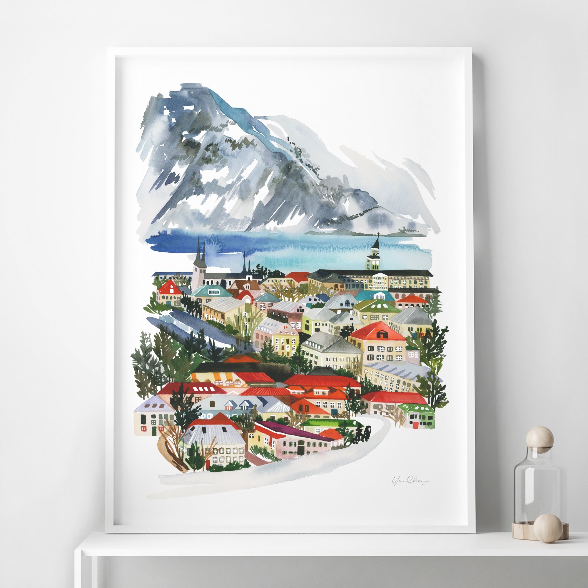
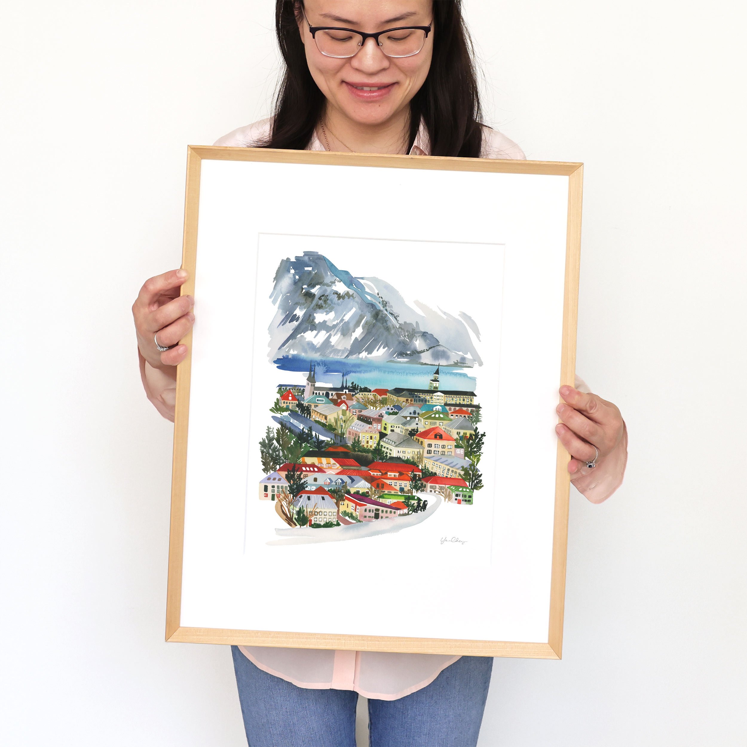
ICELAND:
At some point, I will be painting an accompaniment to my Reykjavík print. The architecture, paired with the dramatic backdrop of Icelandic mountains, is just too stunning not to revisit properly! In the meantime, this first piece was my attempt to understand how the geometric shapes of the buildings in the capitol of Iceland can play visually with a scenic backdrop. It was fun to push myself to paint an artwok so much detail and see how I liked creating art in this more illustrative style.
in the shop:
You can find it as both an Art Print and a Tea Towel! As an unique keepsake, it’s been a popular gift for friends and family who recently traveled to Iceland.

Reykjavik, Iceland / In Progress / Yao Cheng


Reykjavik, Iceland / Tea Towel / Yao Cheng Design

check back for updates!
I cannot wait to see what other winter pieces I’ll be adding to this series! Be sure to check back on this post for future updates. But for now, I’ll leave this post with a very common occurrence during my painting weeks: paintings spread all over the floor of my studio.
Why do I do this? I honestly don’t know. The only answer I’ve come up with from a decade of making art is that it provides just the right distance for me to see the artwork and assess where I’m at without standing up. Also, here’s a fun sneak peek- the bottom left is the beginning of a painting of Istanbul, Turkey!

Art Studio / Yao Cheng Design